Annual reporting can be daunting.
It’s not easy to think of new ways to frame, design and present what is often repeated messaging and content (with new numbers) to largely the same audience. We all face the challenge of ensuring recipients stay engaged with and informed by the annual report, which means producing materials that keep them opening it up each time they receive it.
Repeated messaging and content is not negative – we know consistency is important to be sure you’re always reporting out on programs/initiatives and areas your donors care about, whether it be programs they might give to in the future or something they’ve invested in for years. But introducing new content and especially new ways to illustrate and provide the information is equally important. Where do you begin? What if you don’t have a digital or design-savvy person on your staff, or, you are that person but you are desperately in need of some new ideas? We looked at a few resources to curate some potential solutions, and used a great example at our fingertips – the Sigma Phi Epsilon Foundation 2016 Annual Report – to show them in use.
And for fun, take a look at what could be the Annual Report of the future. The Tableau Foundation maintains a “living annual report” updated weekly on their website.
1. IF YOU’RE NOT ALREADY DIGITALLY PUBLISHING YOUR ANNUAL REPORT, START!
You may never want to stop printing your Annual Report, but supplementing with a digital version is more important than ever. An increasing number of current donor generations, as well as generations who will become your donors, are digital-centric. They consume their news and favorite brands exclusively online, keep in touch almost 100 percent via text message/social media/apps (not even email in some cases), and are more likely to de-legitimize something that does not have a companion digital/web-based component. Many are consuming digital content exclusively on their mobile device.
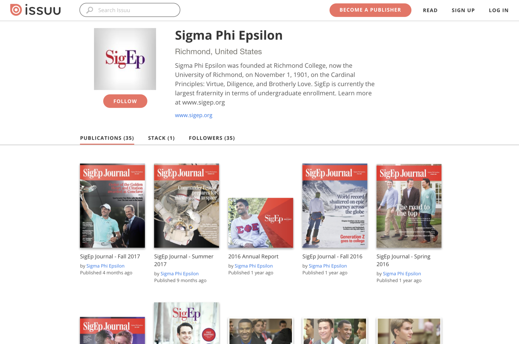
We not only had Sig Ep’s printed Annual Report to look through, but their digital report as well. Digital publishing platforms are visually appealing and meet that digitally-focused audience where they want to receive content. They can be used to direct viewers to other online properties like social media, websites, etc. to create an integrated experience. There are varying digital publishing platforms available that differ based on price point and capabilities; some are free with limited publishing tools but provide a clean and visually-appealing digital option for recipients, while some are more expensive but provide opportunity for customization and integration to really wow the audience. You may be able to start out with something that allows publishing for optimal desktop viewing, and strategize later for a more advanced tool that offers responsive design for mobile devices. Some platforms, like Issuu pictured below, are somewhat of a social media tool as well, providing a catalog of current and past content, allowing you to “follow” for updates on new content, etc. Find more digital publishing platforms and ideas here.
2. INCORPORATE MORE VISUALLY-INTERESTING DESIGN AND PACKAGING OF CONTENT EVERY YEAR (READ: LESS TEXT!)
Although an Annual Report is not a magazine or a piece of graphic artwork, it can and should be approached like one and the trends we see in them today. As consumers, members and donors are becoming more interested and thus more likely to remember and respond to graphically interesting content that is easy to read and pleasing to the eye. Even magazines are starting to lessen the use of text in columns and amount of text on one page, packaging information in a different way that is more retainable and guides the eye through the information.
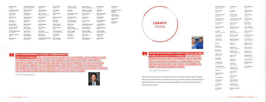
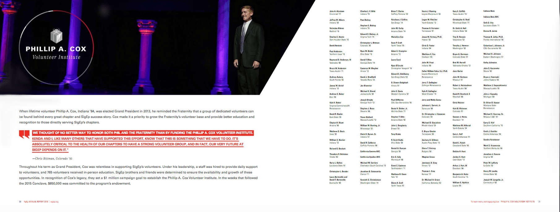
You’ll likely never be able to get away from columns of donor names or scholarship recipients – that information is important and communicates the mission just as much as anything else. But, similar to the spreads of content we especially liked in Sig Ep’s report, the quantitative content is more likely to be read and enjoyed if the qualitative content – pleasing visual presentation, graphically interesting treatment to stats and numbers, breaking up of text, more white space – is done extremely well.